
These 2023 patio furniture color trends offer endless opportunities for creating an inviting garden or patio where lasting memories are made. Choose your favorites and create the ideal environment to make those memories!
As opposed to purchasing seasonal patio sets from big box retailers, opt for quality furnishings made in America instead.
Bold Yellows
Yellow hues add an energetic splash of color to patio decor, whether used for accent pillows or an entire wicker sofa set. Incorporating bold hues with natural wood finishes for a balanced look; pair a buttery yellow outdoor sectional with brown wicker chairs and an earth-tone rug; bold prints in cool colors like emerald green are also in-style this summer; opt for old-school Florida vibes with palm frond designs, neon pink and orange neons as well as geometric patterns or sayings printed bold fonts are among our trendy summer picks!
Light yellow hues such as Hay and Pale Hound work well in both modern and traditional spaces, adding subtle cheer. They work equally well on walls and ceilings – for those hesitant about painting an entire room yellow, consider painting just door or window trim in bold yellow!
Light blue and sunny yellow hues create a refreshing combination that perfectly balances green patio furniture. Opting for darker and vibrant shades can have a striking impact; lighter colors may have more subdued effects. Try pairing dark blue striped curtains with your brown wicker sectional, or matching yellow wicker chairs with blue throw pillows for an eye-catching aesthetic. 336 Bold Yellow by Benjamin Moore is a versatile yellow paint that works well with blues, greys and reds; its built-in primer and top coat makes creating smooth finishes effortlessly.
Vibrant Blues
Vibrant blues are an eye-catching patio furniture trend, known for its versatility and soothing nature. This hue works particularly well when combined with green furniture as its hue complements that found in nature – creating an organic aesthetic in your outdoor design. If opting for vibrant blue, pair it with neutral accents such as beige or gray throw pillows to balance out its look.
Soft pink shades add an air of femininity and romance to your backyard layout, as well as being perfect for accentuating intricate patio chairs or rugs such as those found on wrought iron sets or elegant wicker couches.
Yellows and blues make an ideal combination with green patio furniture due to their proximity on the color wheel. There are numerous hues of green that pair perfectly with buttery yellow or soft denim blue hues such as the grassy meadow hue Behr calls “Back to Nature.” To emphasize these colors even further, opt for furniture with dark finishes, such as teak conversation sets or brown wood wicker coffee tables; for something subtler try seafoam or mint hues instead.
Soft Pinks
Soft pinks and pastels add feminine charm to a patio, providing an inviting ambience perfect for outdoor entertaining areas. Pair these shades with black wicker furniture to create an opulent dining area.
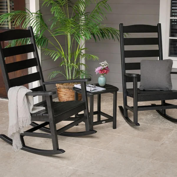
Black wicker furniture provides an eye-catching contrast against any color in your palette, whether that means vibrant reds and oranges or soothing blues and greens with yellow. Black wicker can add dimension and create striking visuals in any setting.
Bring Glidden’s Vining Ivy into your backyard oasis with black wicker chairs, couches or sectionals. Glidden’s Vining Ivy is an earthy hue combining blue and green hues for an eye-catching yet soothing backdrop.
Cool Purples
Purple is an inviting color that has the power to calm and unwind, making it the ideal choice for seating areas. Use lavender outdoor chaise lounges or throw pillows for a soothing vibe, while pairing purple patio furniture with green patio furniture creates a balanced look which promotes restfulness and rejuvenation.
While its name might indicate otherwise, this soft purple shade is actually quite relaxing and reminds one of a gorgeous spring sky. Furthermore, its light hue pairs well with both warm and cool tones for maximum versatility.
Another soothing periwinkle-inspired shade, this one leans more toward blue than other purples. Perfect for use in both north- and south-facing rooms as long as there’s enough natural light, this soothing hue works in any situation.
With an LRV of 76, this deep purple hue comes close to red but veers more towards blue than green. Bringing an air of quiet confidence to any space it works especially well in north-facing rooms.